Your Ripe Map
How to Use Ripe’s New Map Styles
Introduction
Ripe now offers four updated Ripe Map styles that replace our older legacy versions. These new styles are designed to highlight each destination’s unique character, offer flexible pin controls, and provide improved visual clarity while aligning with today’s design standards. Each style supports two selectable versions: one with Google pins (landmarks and POIs) and one “clean” version that still includes restaurant pins but hides certain other Google categories, making it ideal for highlighting Ripe pins and allowing full customization of your maps.
This guide explains each new map style and how to choose the right version based on your destination’s needs. We also provide a comparison to legacy styles and outline how to prepare for implementation.
Note: While we recommend upgrading to one of the new styles, we respect your preferences. The Google Default style is still available as an option for clients who wish to retain it.
When to Use This SOP
Use this guide when:
- You’re refreshing your lodging or event landing page map styling.
- You want to replace legacy map styles with cleaner, modern alternatives.
- You want better control over map overlays using Ripe pins.
- You want a visually simplified map without default Google landmarks or place pins.
Overview of New Map Styles
Each new map style includes two selectable versions:
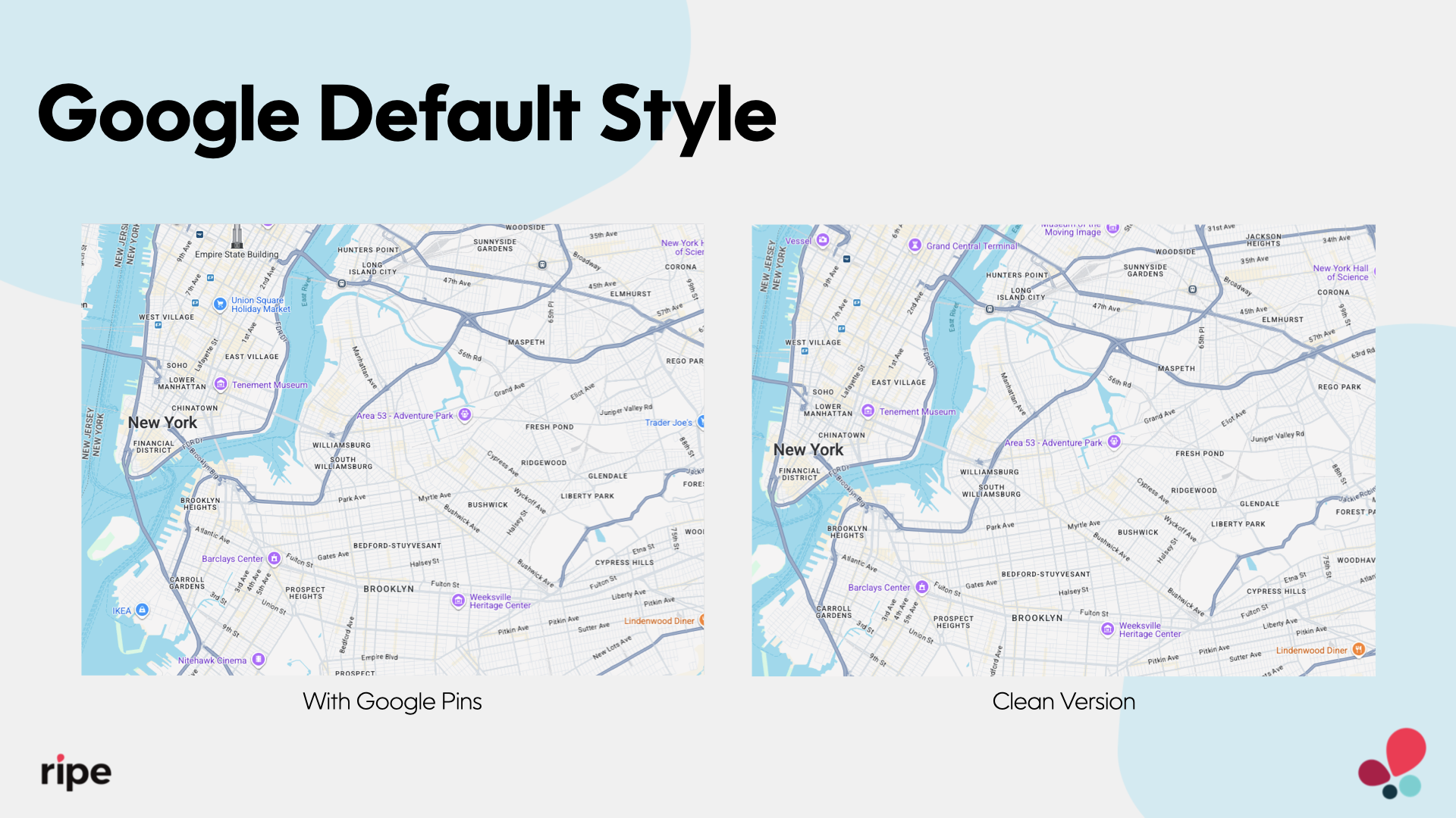
- With Google Pins: Includes Google’s default points of interest, such as restaurants, attractions, services, and retail stores.
- Clean Version (without Google Pins): Hides certain Google categories (e.g., attractions) but still includes restaurant pins, making it perfect for layering your own Ripe pins, such as hotels, venues, or local highlights
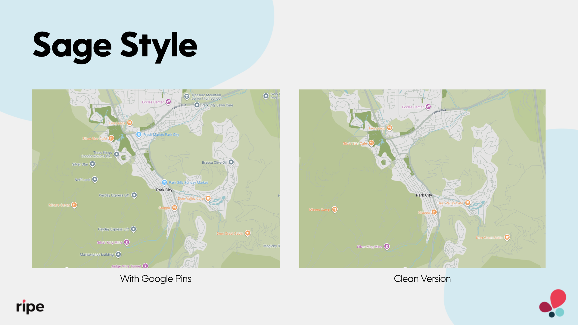
Sage Style
Best for: Areas with natural landscapes, trail networks, or outdoor-focused experiences.
Sage Style features a calm, terrain-forward design with soft earth tones and subtle elevation shading. It highlights natural features while maintaining clear visibility for listings and pins. Ideal for mountain towns, rural getaways, and scenic regions, it offers a balanced, neutral aesthetic that fits seamlessly into any destination’s brand.
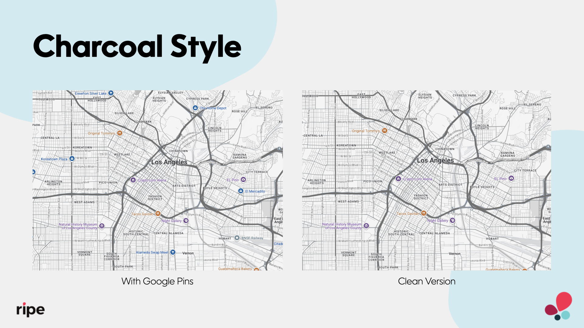
Charcoal Style
Best for: Regions that need a clean, high-contrast map to support overlays, accessibility, or brand flexibility.
Charcoal Style offers a sleek, monochromatic design that puts traveler information and listings front and center. Its high contrast and neutral tones make it ideal for destinations prioritizing data visibility or performance.
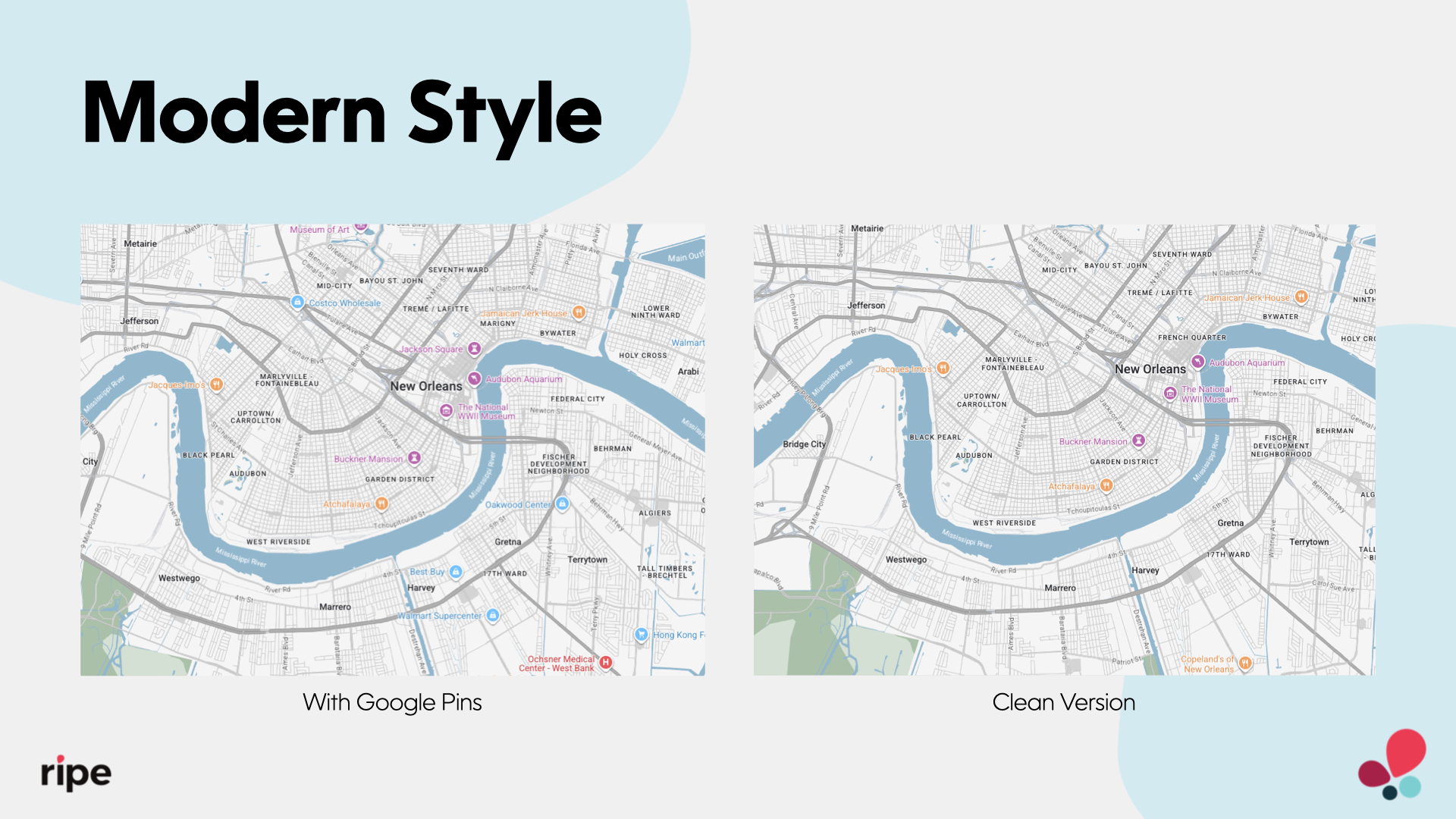
Modern Style
Best for: Areas with structured layouts, event hubs, or districts that benefit from a clean and contemporary look.
Modern Style offers a balanced, grid-forward design with sharp labeling and subtle contrast, making navigation effortless in high-density environments. Its sleek aesthetic and cool-toned palette adapt easily to a variety of branding needs. Ideal for highlighting lodging, event venues, and walkable areas in both urban and mixed-use settings.
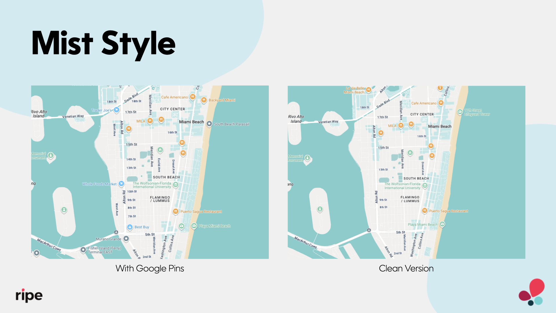
Mist Style
Best for: Regions seeking a light, calming map style that pairs well with soft color palettes and diverse brand aesthetics.
Mist Style features a soft, airy design with muted tones and clear contrast, offering a visually gentle experience for travelers. Its balanced color theme—cool aquas, pale sands, and light grays—provides clarity without distraction. Ideal for showcasing listings, routes, or events in both urban and natural settings, Mist Style blends seamlessly across a variety of destination types.
Google Default Style
Best for: Locations that benefit from a familiar, easy-to-navigate map experience trusted by a wide range of users.
Google Default Style uses the standard Google Maps design, offering broad recognizability and intuitive usability for travelers. Its balanced color palette and clear labels make it a reliable choice for simplicity and consistency. Ideal for destinations that prioritize familiarity, ease of use, and alignment with widely used digital map interfaces.
Comparison to Legacy Map Styles
| Legacy Map Styles | Key Issues | New Replacement | Improvements |
|---|---|---|---|
| Modern (Legacy) | Bright colors, thick roads, cluttered UI | Modern Style (Revamped) | Grid-forward design with modern contrast and clean labeling for improved clarity |
| Classic 3D | Outdated shadows, overly complex presentation | Sage Style | Terrain-forward with soft earth tones and elevation shading for a natural look |
| Greyscale | Harsh contrast, heavy visual weight | Charcoal Style | High-contrast, monochromatic design with better readability and support for overlays |
| Monochromatic | Flat design, minimal visual distinction | Mist Style | Light, open layout with gentle contrast and terrain lines for a calm, clear interface |
🛠️ Need help? Reach out to your Client Success Manager for assistance applying styles or previewing changes before publishing.
Updated 4 months ago